Evaluation: Question 5
Evaluation Question 3
Evaluation Question 6
we used a Lumix DMC G10 21.1 MP. Which was a really good camera to use for our piece, the quality was much better than if we just used our phones. It also allowed us to get everything filmed at one point, instead of having to delete everything off the camera to re-film a shot or continue filming.
For sound we kinda just used the camera’s microphone instead of buying a completely new one. I think it would’ve been much better if we actually used a separate microphone because then the actors and actresses might have been heard clearer, this would mean that when we used sound filters it would only be heard through the speaking rather then the full video. We got sound effects off of YouTube and with the soundtrack as well, we had ambient sound for the beginning train scene as well to create the atmosphere that the audience where actually at the train.
For editing we used Final Cut Pro, this was the school’s software, which really allowed us to explore new and exciting ways to actually create a successful horror film. We were able to use filters to shift from the past to the present as well as us fast paced editing to create tension for the audience.
For camera angles, we did a fair amount of them, which we were really proud of. From XCU (Extreme Close Up) to LS (Long Shot), we wanted to use as much variety as possible in our piece allowing the audience to feel excited and intrigued by our piece.
Sound played a huge part in making our horror movie fit with the horror genre, we used a soundtrack that created a creepy and weird atmosphere when Eva dies creating tension for the audience with whatever she encounters next. We had diegetic sound, like a cover of ‘Cheerleader’ to get our target audience intrigued with the scene. The car screech, the train conductor, the screaming of the woman, where all pieces of diegetic sound that we used in our piece. Non-diegetic sound we had the white noise, which we could also consider as diegetic sound dependant on which character heard it (Eva or Eva’s friend). We had ambient sound as well, birds cheeping, footsteps, wind which made the atmosphere feel more realistic and surreal.
Evaluation question 4
Our Target Audience:

We wanted our primary audience to be teens under the age of 18. Allowing us to use conventions that we felt where interesting as well as not use conventions that we deemed were not needed/appropriate for our age.
We wanted our piece to appeal to both sexes, by using conventions that both male and female audiences will enjoy. We wanted to appeal to teenagers with the interests like; horror films and female antagonists, massive plot twists and demonic supernatural films. Basically we wanted to have an audience that were interested in our conventions. The class and status we tried to have our main character as the working-class normal teenage girl too allow the female audience to relate to the character.
Our main goal with our target audience is to relate them to her. Giving them scenarios that our audience would relate to.
Why did did we choose this target audience for our product?
Most of the horror films we researched where for older audiences, or their target audiences were adults regardless of the certificate. We wanted to have an option for younger teenagers with the passion for horror films, to have this choice to watch a more freaky film rather than a jumpscare nightmare that’ll just freak them out.
People who don’t watch horror films also could use this film as a starter, showing that there are key elements that make a scary movie, scary, giving them the push to explore the different types of horror films out there
Evaluation Question 2
Evaluation: Question 1
What research did you do?
We started off by researching into some of the demonic possession films that people recognised from our survey and tried to find some of the key elements shown in each of the films. We researched into the film’s target audiences and how they reached out to them during the marketing and exhibition process. We then went into more detail focussing on particular elements that we wanted to contribute to our piece.
What did you find out/what did you use in your own film?
We found a lot of similarities when it came to Mise-En-Scene in the films that we researched, especially with costume and makeup, the costumes were simplistic and clothes you would see anyone wearing nowadays. Makeup made the possessed characters look skinny, pale and exceptionally creepy to allow the audience to realise there is something wrong with the character. The target audience’s for all these films are male adults, which gives the mindset that most horror films are solely targeted for male audiences. We decided to keep the same type of Mise-En-Scene that we noticed in the films as well as the use of soundtrack and non-diegetic sound.
Where there any ideas/things that you thought were useful or thought you ought to keep out?
We decided to keep out the jumpscares and the generic conventions to a horror film because we wanted audiences to realise this was an original demon possession film. We also kept out showing the character (Eva) getting possessed unlike some of the films we researched like ‘Ghost Rider’. We kept the scenario the same, having the main character face an impossible task and make them choose between right and wrong, only to have them loose the one thing that keeps them together. We did this because we wanted to allow the audience to see some of the favorited elements in demon possession films in our piece.
Final film edit: Eva
Editing Evaluation
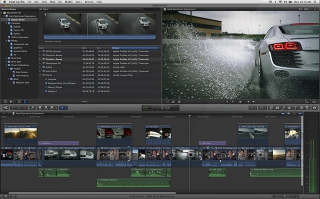
We used Final Cut Pro for our editing software, which allowed us to perform certain things that Movie Maker and Windows Live Movie Maker wouldn’t allow us to do. Like have more than one sound effect overlapping another, we did this to allow the soundtrack to be heard overhead as well as added diegetic sound to be present. An example of this would be when we first encounter Eva on the train, An eerie soundtrack can be heard as well as the overhead train conductor adding more to the scene.
Another advantage of us using Final Cut Pro instead of Movie Maker is that we were able to add effects to the audio as well as the video itself. An example of this is when Eva has her first encounter with The Devil, you can hear the blurriness in the character’s voice to allow the audience to depict the difference before and after the crash.
Like mentioned before we were able to use effects on the video as well, we wouldn’t be able to show the change in situations without the choices on Final Cut Pro. With Final Cut Pro, they have a numerous amount of effects to choose from, unlike Movie Maker, which allowed us to create a difference with the dream sequence and modern times. Whereas if we used Movie Maker the only way we’d be able to tell the two scenarios apart with the black and white filter which was too generic from our horror movie.
Finally another advantage to using Final Cut Pro instead of Movie Maker was the fact that we could use more interesting text effects than we could if we used Movie Maker, Movie Maker only has the generic fade and wipe in, whereas with Final Cut Pro we were able to use text effects that worked with the genre and the rest of the scene.
Production Company Logo
One of the production logos we used was Warner Brothers. We used this because Warner Brothers is one of the leading production companies that create successful horror movies like:
- The Conjuring
- Annabelle
- The Exorcist
- The Shining
- Lights Out
We used this particular one because it works well with the creepy, eery theme of the opening trailer, we didn’t use the original or the darker version because we wanted the audience to recognise that our opening sequence wasn’t a ‘normal’ horror film with the generic conventions. This particular opening was taken from the 2009 horror film Orphan. With that movie it has the main character as a woman, like ours, and also has demon possession which is also one of the conventions of ours 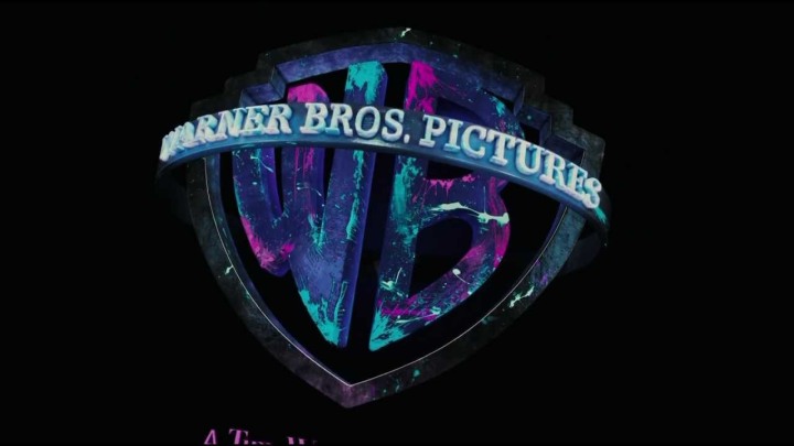
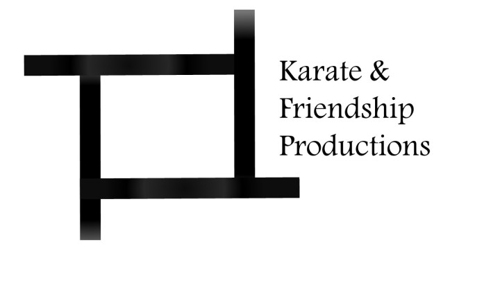
The second production logo ‘Karate and Friendship Productions’ was created off of Powerpoint, the main basis for it is that the four lines fly in from different sides. After they all create a sort of square shape, the production name fades in. The main reason it’s like this is because we didn’t want something that the audience would have to sit through for ages like other production company logos, we wanted it to be easily recognisable as well as quick and easy.