One of the production logos we used was Warner Brothers. We used this because Warner Brothers is one of the leading production companies that create successful horror movies like:
- The Conjuring
- Annabelle
- The Exorcist
- The Shining
- Lights Out
We used this particular one because it works well with the creepy, eery theme of the opening trailer, we didn’t use the original or the darker version because we wanted the audience to recognise that our opening sequence wasn’t a ‘normal’ horror film with the generic conventions. This particular opening was taken from the 2009 horror film Orphan. With that movie it has the main character as a woman, like ours, and also has demon possession which is also one of the conventions of ours 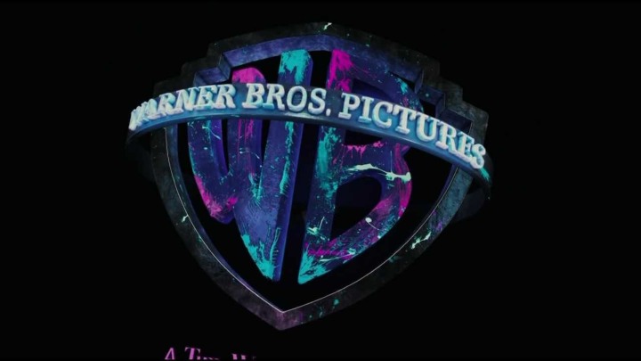
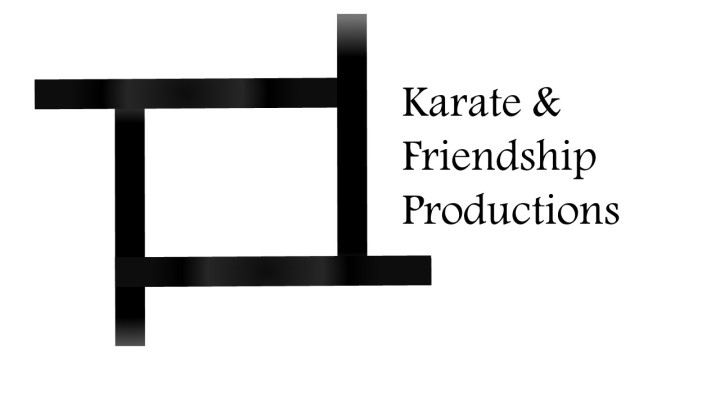
The second production logo ‘Karate and Friendship Productions’ was created off of Powerpoint, the main basis for it is that the four lines fly in from different sides. After they all create a sort of square shape, the production name fades in. The main reason it’s like this is because we didn’t want something that the audience would have to sit through for ages like other production company logos, we wanted it to be easily recognisable as well as quick and easy.